
10 Plumber Website Design Examples: Features That Generate Leads
Written by the Sclouta team. Published 25 August 2026.
Most plumber websites look fine. Clean logo, a photo of a van, a contact form somewhere near the bottom. And most of them are quietly losing jobs every single week.
The difference between a plumber website that generates enquiries and one that just exists usually isn’t budget. It’s a handful of specific design decisions, the kind that are easy to spot once you know what you’re looking for, and easy to miss if nobody’s ever pointed them out. Below are 10 plumber website design examples built around features that can help generate enquiries, not just make a website look professional.
These examples show different ways a plumber website can be structured around the things that matter most to customers: clear calls to action, trust signals, service areas, service pages, mobile usability and local search. Each example focuses on a specific design decision and explains why it can help turn website visitors into enquiries.
Why Most Plumber Websites Lose Jobs Before the Phone Even Rings
Plumbing has a psychology most other trades don’t share to the same degree: the customer is often already experiencing damage while they search. Water is actively spreading. A ceiling is staining. A bathroom floor is flooding. This isn’t someone planning ahead. It’s someone trying to stop something getting worse right now.
A homeowner with a burst pipe isn’t browsing. They’re comparing three or four plumber websites in under two minutes, usually on their phone, usually while the situation is actively getting worse. In that window, a website either answers their unspoken questions instantly, do you cover my suburb, are you legit, how do I reach you right now, or the visitor bounces to the next tab.
A website that makes someone hunt for a phone number, scroll past a wall of text to find out what suburbs are covered, or load slowly on a 4G connection has already lost that job. Not because the plumber wasn’t qualified, because the website got in the way.
What Separates a Good Plumber Website From a Forgettable One
Strip away the styling and colour choices, and the plumber websites that consistently perform well share a small set of underlying decisions. They answer trust questions before the visitor has to ask them. They make contact effortless rather than optional. And they’re built around how someone actually behaves mid-emergency or during a planned job, not around how a designer imagines a homepage should look.
None of this requires a huge budget or a flashy build. It requires knowing which decisions matter and getting them right.
10 Plumber Website Examples: What Each One Gets Right
| Example | Homepage Focus | Why It Works |
|---|---|---|
| 1. Emergency Plumber Homepage | Urgent hero + click-to-call | Matches mid-crisis search intent |
| 2. Local Perth Plumber Homepage | Suburb list + local trust signals | Confirms coverage instantly |
| 3. Hot Water Specialist Homepage | Single-service focus | Matches specific high-intent searches |
| 4. Trust-First Homepage | Licensing strip near the top | Answers legitimacy before it's asked |
| 5. Review-Led Homepage | Testimonials near the CTA | Builds social proof at decision point |
| 6. Multi-Service Homepage | Dedicated service pages | Improves scannability and search visibility |
| 7. Mobile-Optimised Homepage | Sticky tap-to-call button | Removes mobile friction |
| 8. Quote-Flow Homepage | Simple booking form | Converts faster than a generic contact form |
| 9. Map-Pack-Aligned Homepage | Consistent GBP + website details | Strengthens local search visibility |
| 10. Mobile-First Layout Homepage | Built for phone screens first | Matches how plumbing customers actually search |
Example 1 — Emergency Plumber Homepage
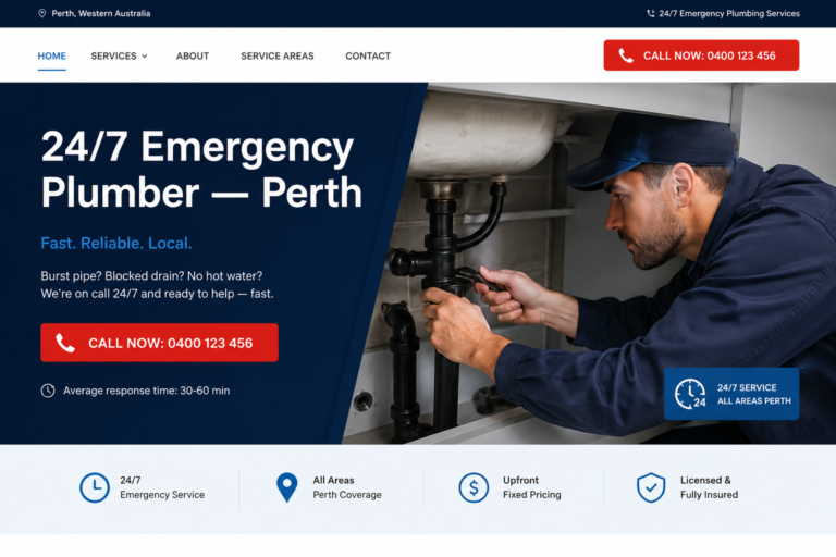
[MOCKUP: hero section with headline “24/7 Emergency Plumber, Perth” over a large tap-to-call button, no other clutter above the fold]
The top of this homepage speaks directly to the most common reason someone landed there, a burst pipe, a blocked drain, no hot water, with a phone number visible before any scrolling happens.
What works: the headline names the exact problem the visitor likely has, the phone number is the single largest element on the screen, and there’s nothing else competing for attention above the fold. This works because it matches search intent. Someone typing “burst pipe Perth” or “emergency plumber near me now” is not in a browsing mood. A hero section that immediately confirms yes, we handle this, here’s how to reach us removes the single biggest source of hesitation.
Example 2 — Local Perth Plumber Homepage
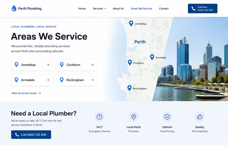
[MOCKUP: homepage section listing serviced suburbs, Joondalup, Cockburn, Armadale, Rockingham, beneath a “Proudly serving Perth homes since [year]” line]
Before a homeowner reads a single word of copy, they want to know one thing: does this plumber actually work in my suburb? This homepage answers that visually, with a clearly listed suburb range placed near the top, not buried three pages deep in a “service areas” link.
What works: for a business covering a spread-out city like Perth, naming specific suburbs rather than a vague “Perth Metro” tag reduces unnecessary website exits from visitors who are unsure about coverage, and it gives the page more specific terms to rank for locally.
Example 3 — Hot Water Specialist Homepage
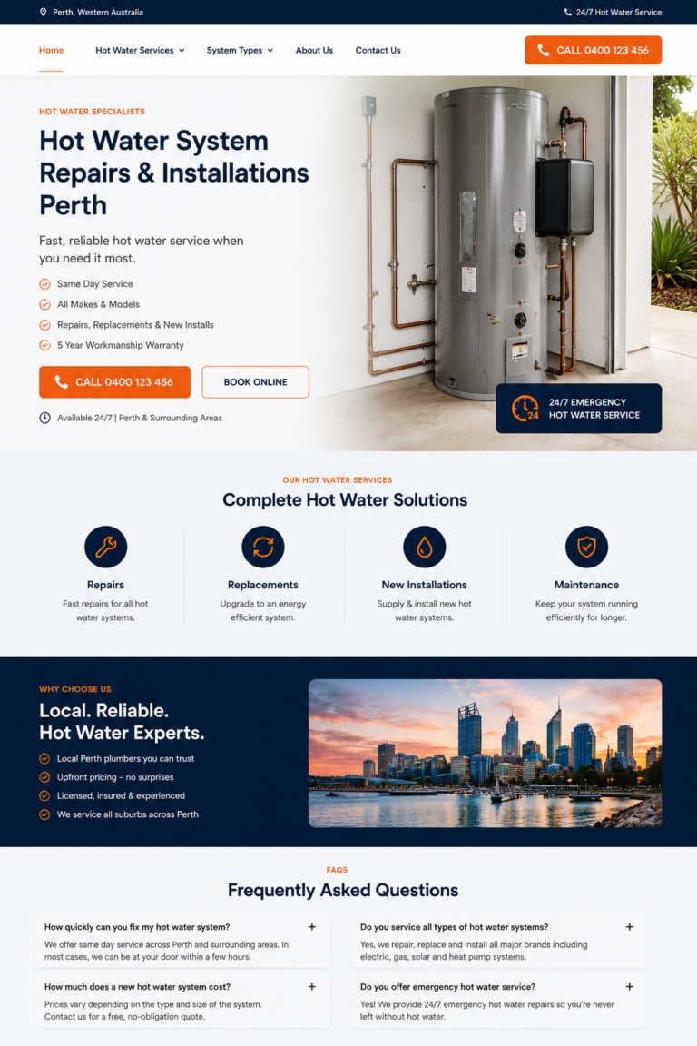
[MOCKUP: homepage built entirely around one service, headline “Hot Water System Repairs & Installations Perth,” FAQ block, single clear CTA]
Rather than trying to be everything to everyone, this homepage commits to one service and speaks directly to it throughout.
What works: someone searching “hot water system replacement Perth” doesn’t want to land on a generic plumbing homepage and go hunting, they want immediate confirmation this business specialises in exactly their problem. A focused single-service page can provide a clearer experience for high-intent, specific searches than a general homepage trying to cover everything at once.
Example 4 — Trust-First Homepage
[MOCKUP: horizontal strip beneath the hero showing licence number, insurance badge, and years-in-business icon]
Licensing matters enormously in plumbing work, and this homepage doesn’t leave visitors to assume it or dig for it. A visible strip showing licence details and insurance sits directly beneath the hero, not buried on an About page.
What works: for homeowners letting a stranger into their home, often mid-emergency, this kind of visible legitimacy marker is one of the fastest ways to move from “maybe” to “yes.” It’s also worth pairing with a well-optimised Google Business Profile, since for many searchers, that’s the first trust signal they see before they ever click through to the website.
Example 5 — Review-Led Homepage
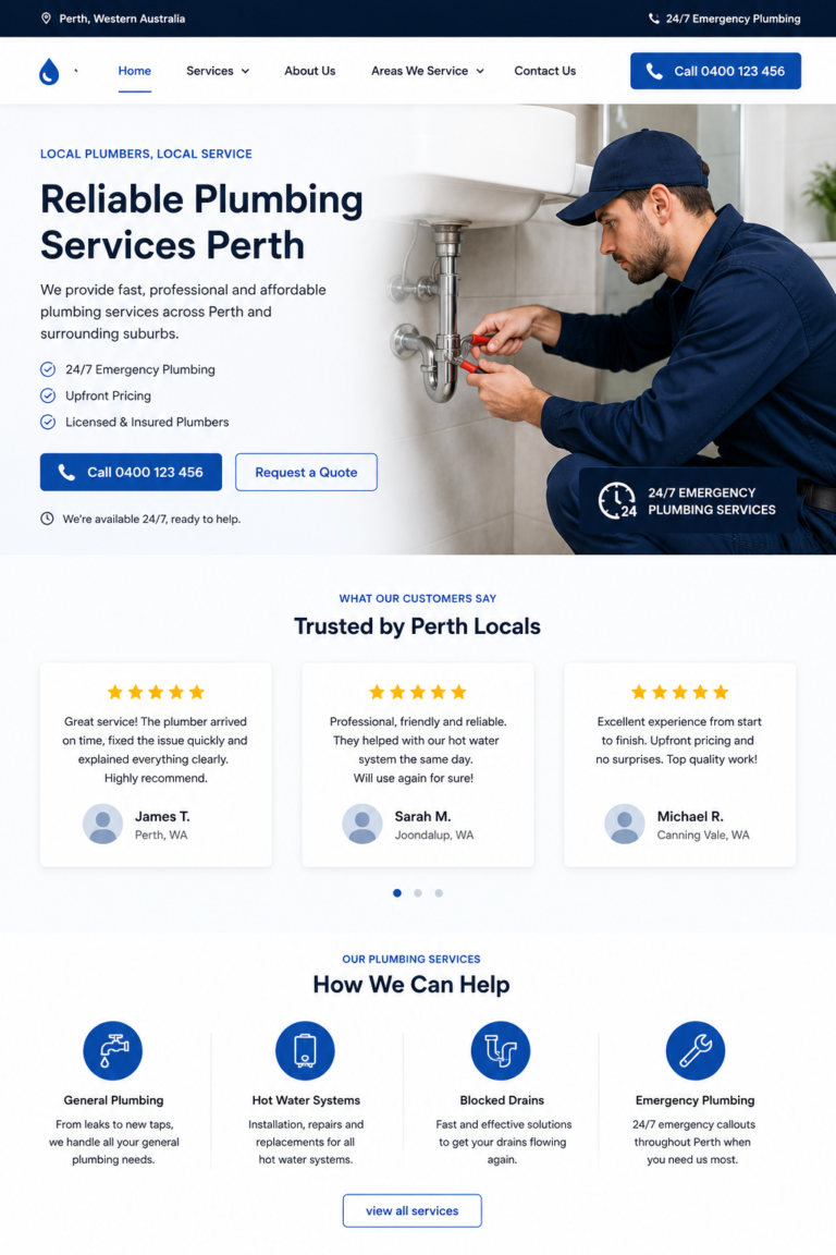
[MOCKUP: three review cards with star ratings placed directly below the hero, above the services section, illustrative example only, not real customer reviews]
Testimonials tucked away on a separate “reviews” page rarely get seen. This homepage surfaces a handful of reviews right after the hero, close to where the visitor is still deciding whether to make contact.
What works: if a website doesn’t display any reviews at all, a visitor has to leave the site entirely to go verify credibility elsewhere, and every visitor who leaves to check is a visitor who might not come back. Social proof works because plumbing work is inherently risky for the customer; seeing evidence that other real people had a good experience lowers that perceived risk at exactly the moment it matters most.
Example 6 — Multi-Service Homepage
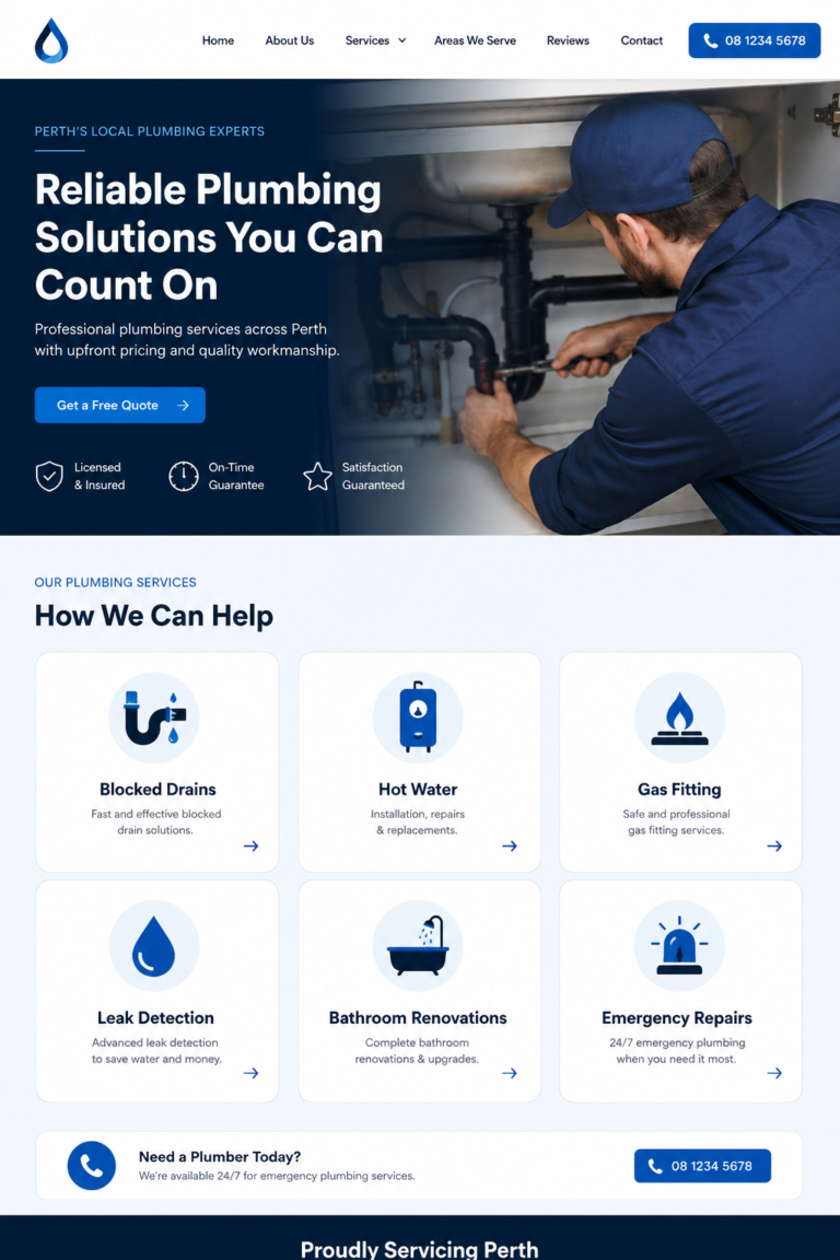
[MOCKUP: services grid with six icons, blocked drains, hot water, gas fitting, leak detection, bathroom renos, emergency repairs, each linking to its own page]
A single page listing every plumbing service in one dense block doesn’t help anyone find what they need, and it doesn’t help Google understand what the business actually does. This layout uses a scannable grid instead, with each service linking through to its own dedicated page.
What works: someone searching for “blocked drain repair” wants confirmation, fast, that this business does that specific job. Dedicated pages behind a clean grid do two things at once, they make the homepage easier to scan for a visitor in a hurry, and they give each service its own chance to rank for its own specific search, rather than one generic page competing weakly for everything at once.
Example 7 — Mobile-Optimised Homepage
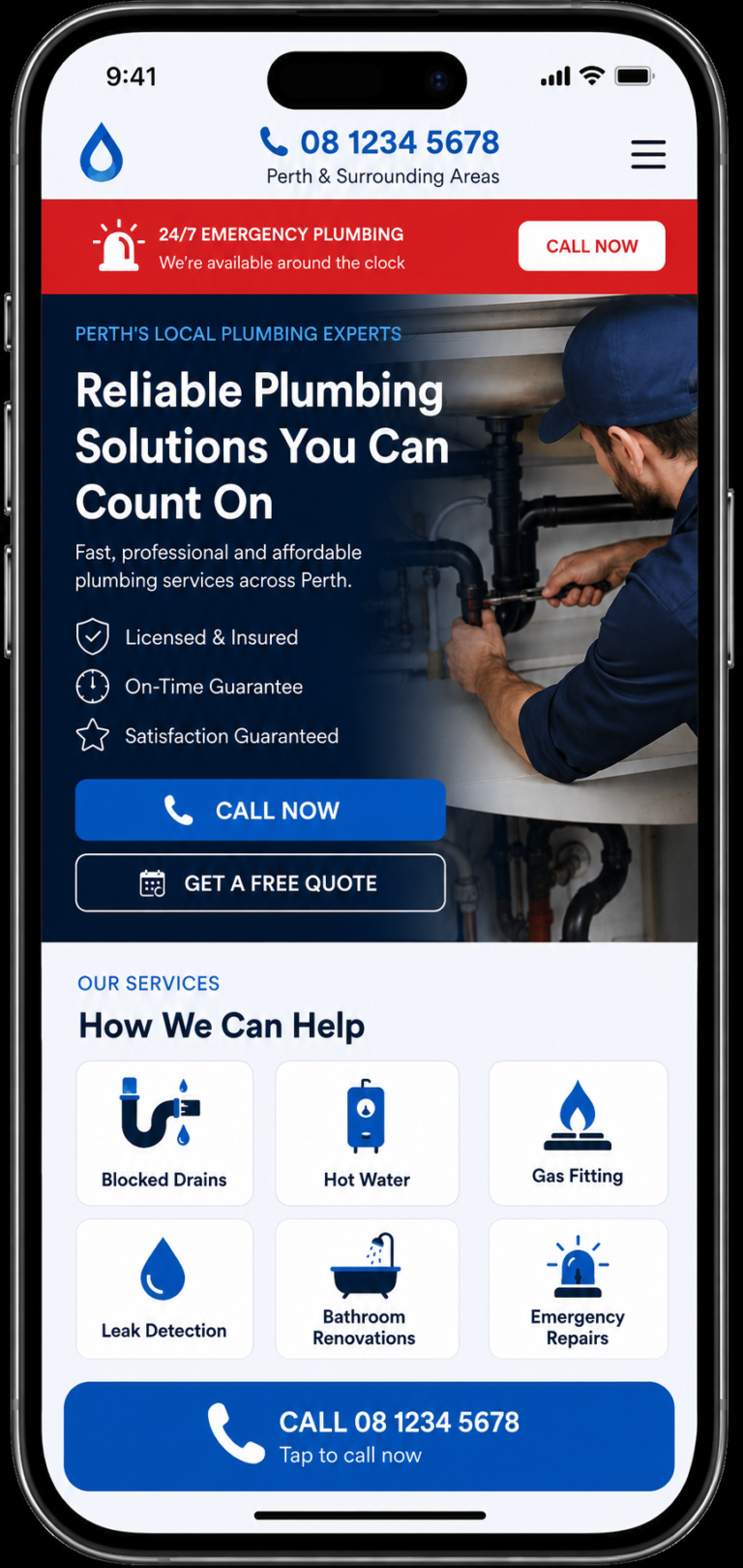
[MOCKUP: mobile plumber website with a sticky “Call Now” bar fixed at the bottom, a clearly visible phone number, large tap-to-call CTA, and emergency contact option]
A click-to-call homepage is designed around one simple action: making it as easy as possible for a mobile visitor to contact the plumber. The phone number is clearly visible, the primary CTA is easy to tap, and the emergency contact option stays accessible while the visitor scrolls.
What works: the sticky call button keeps the main conversion action within reach at all times. Large tap targets reduce accidental clicks, while a clearly labelled emergency CTA helps visitors act quickly when they need immediate plumbing help.
Example 8 — Quote-Flow Homepage
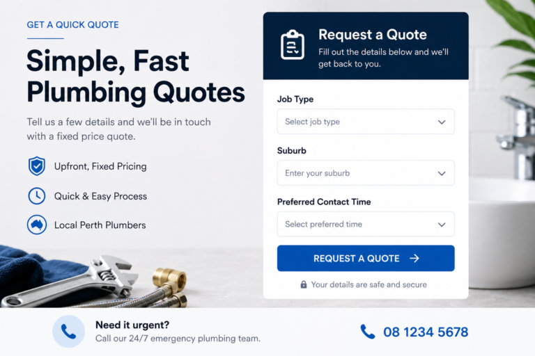
[MOCKUP: short form with three fields, job type dropdown, suburb, preferred contact time, instead of a large open text box]
A traditional contact form asks a visitor to type out a message, wait for a reply, and hope someone gets back to them. This homepage replaces that with a short, structured quote-request flow.
What works: asking for job type, suburb, and preferred contact time feels faster and more concrete to the visitor, and it gives the plumber better-qualified information before the first call, fewer back-and-forth messages just to understand what the job even is.
Example 9 — Map-Pack-Aligned Homepage
[MOCKUP: homepage footer showing business name, address-area, and phone number formatted identically to a Google Business Profile listing]
A website on its own isn’t enough. This homepage keeps its business details: name, service area, phone number, consistent with what’s listed on Google Business Profile, rather than treating the two as separate.
What works: A website and Google Business Profile should reinforce the same local business information rather than presenting conflicting details. Consistent business information gives customers a clearer experience across Search, Maps and the website and can support local visibility. If you want to understand how plumbers can improve their visibility in the local Map Pack, see our guide to ranking plumbers in Google’s Local Map Pack.
Example 10 — Mobile-First Layout Homepage
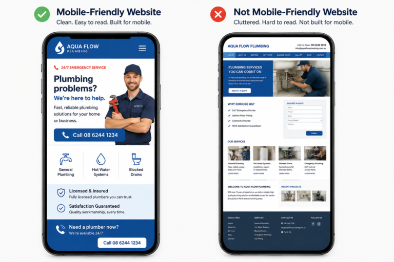
[MOCKUP: mobile-first plumber website showing clean navigation, readable typography, generous spacing, short content blocks, clear headings, and well-organised service sections]
A mobile-first plumber website is designed for the phone screen from the beginning rather than taking a desktop layout and shrinking it down. The navigation, typography, spacing and content hierarchy are all structured around how someone actually reads and interacts with a website on a smaller screen.
What works: clear headings make the page easy to scan, readable text avoids unnecessary zooming, generous spacing makes links and buttons easier to tap, and a simple navigation structure helps visitors reach services and contact information without getting lost.
The Mistakes That Quietly Cost Perth Plumbers Leads
A handful of issues show up again and again on underperforming plumber websites, and none of them are dramatic on their own, which is exactly why they’re easy to miss.
A phone number styled as plain text instead of a tappable button is one of the most common. On mobile, this forces a visitor to manually copy or memorise a number instead of tapping once to call, for a homeowner mid-emergency, that extra step is often the difference between a call and a lost job.
Slow loading on mobile can cost jobs silently, since many plumbing searches happen when a customer needs help quickly and a visitor won’t wait for a slow page to load.
Licensing mentioned once on an About page, rather than where a homeowner is actually deciding, does very little for someone scanning quickly to confirm legitimacy.
Every service crammed onto one page instead of given its own makes a visitor work harder than they’re willing to, and gives the site less to rank for.
No reviews displayed anywhere on the website forces a visitor to leave the site to verify credibility elsewhere, which risks losing them before they come back.
None of these are complicated to fix individually. What matters is that they tend to show up together, because they usually come from the same root cause: a website that was never actually built around how plumbing customers search and decide.
How to Know If Your Website Is One of the Good Ones
A useful gut check: open your own website on your phone, using mobile data rather than wifi if possible, and try to book a job as if you were a stressed homeowner with a genuine plumbing emergency. Time how long it takes to find a phone number. Notice whether it’s obvious you cover their suburb. See whether anything on the page builds trust before asking for contact details.
If that process feels slow, unclear, or generic at any point, that’s very likely costing real enquiries, regardless of how good the underlying plumbing work is.
Plumber Website Homepage Checklist
Pull the most important patterns above together and a clear picture emerges of what actually needs to be on the homepage for a Perth plumber:
- Clear service area: Perth suburbs covered, stated plainly
- Emergency call button: a tappable phone number visible without scrolling
- Licence details: easy to find, not buried on an About page
- Customer reviews: shown on the homepage, not a separate page
- Individual service pages: hot water systems, blocked drains, leak detection, each with its own page
- Real project photos: actual completed jobs, captioned with the work and suburb
- Mobile-first design: built for a phone screen first, not squeezed to fit one afterwards
None of these are optional extras. They’re the baseline a Perth plumber’s homepage needs to compete for local search traffic and convert the visitors it already gets.
How Sclouta Builds Plumber Websites Like These
Sclouta builds plumber websites for Perth businesses around this exact behaviour, emergency searches decided in seconds, and planned decisions researched over several days. Packages start from $300 for a complete, done-for-you 5-page site, with the $490 Growth package adding local SEO, Google Business Profile integration, and a quote form built for this kind of urgency-driven search.
If you’re still comparing what different providers charge, our guide on plumber website costs in Perth breaks down freelancer, agency and subscription pricing. If you’re wondering whether your own site is missing several of these features, get in touch with Sclouta for a review.