
Painter Website Examples: What Makes a Painting Website Actually Work in Perth
Written by the Sclouta team. Published 24 August 2026.
If you’re looking at painter website examples because you’re planning a website for your painting business, the important question isn’t which site looks nicest. It’s what makes a visitor trust the business, understand the services, and take the next step.
Below are two real Perth painter website builds. Interestingly, they use the same underlying framework, which makes them useful to compare: you can see which structural elements stay consistent and which parts need to become specific to the business. Both were built by Sclouta as design foundations for Perth painting businesses, genuinely useful reference points whether you’re comparing quotes, briefing your own site, or just trying to picture what a well-built painter website could look like for you
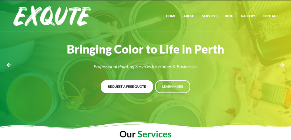
Example 1 — BRZ Painting
BRZ Painting opens with a hero section that pairs the service and the location in a single line: “Bringing Color to Life in Perth.” That might look like a small copy choice, but it’s doing real work: a visitor knows within seconds what the business does and where it operates, without having to scroll or hunt for it. For a painter, that’s exactly what a first-time visitor needs before they decide whether to keep reading or click away.
Directly underneath, the site places licensing and insurance as one of the first trust signals a visitor sees: “Licensed & Insured Professionals” sits right in the “Why Choose Us” section, not buried further down the page. That placement matters because hiring a painter means letting someone into your home or business, and insurance is one of the first unspoken questions in a potential customer’s mind. Answering it early, before they’ve had to ask, quietly removes hesitation.
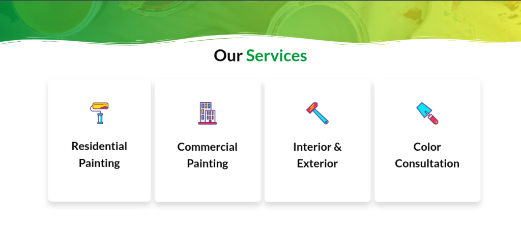
The services section uses simple icons, Residential Painting, Commercial Painting, Interior & Exterior, Colour Consultation, laid out so a visitor can scan the full range of what the business offers in seconds. This matters because painters often serve a wider range of jobs than people initially search for. Someone looking for “exterior house painter Perth” might not think to check if the same business also does commercial work, a clear services layout closes that gap without extra effort from the visitor.
The whole layout is built mobile-first, which matters for a local painter website because potential customers often discover and compare businesses from their phones. Someone comparing painters may be standing in the room they want painted, or scrolling between several quotes. A site that’s slow or cramped on mobile makes that comparison harder before the painter even gets a chance to make their case.
Example 2 — Paint Perfect: Same Structure, Different Brand
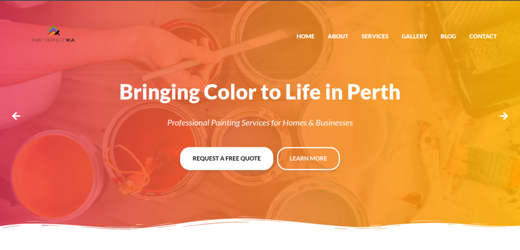
At first glance, Paint Perfect might look like a separate, independently designed painter website. Look more closely, though, and something becomes clear: it uses the same underlying structure as BRZ Painting.
The hero uses the same service-and-location positioning (“Bringing Color to Life in Perth”), the primary quote call-to-action follows the same pattern, and the same four core services, Residential Painting, Commercial Painting, Interior & Exterior, Colour Consultation, appear in the same order. The “Why Choose Us” section follows the same structure too, covering licensing and insurance, materials, execution, and pricing. Even the closing call-to-action follows the same pattern as BRZ Painting’s.

That consistency is worth noticing, because it points to something useful about painter website design: a business doesn’t necessarily need a completely different page structure to have its own website. The underlying framework can stay familiar while the business name, branding, colours, imagery, project photography, reviews and supporting content are what actually make the site specific to that company.
For a painting business, that’s often a sensible starting point. The website needs to answer the same basic customer questions regardless of the brand behind it: what services are available, where the painter operates, why the customer should trust them, and how to request a quote. A repeatable structure that answers those questions clearly isn’t a weakness. It’s a practical foundation.
The important distinction is between a repeatable structure and a finished, differentiated website. A consistent framework like this can provide the foundation, but it’s the business-specific content and proof, real project photos, real reviews, a business’s own voice, that make the final site genuinely credible to a visitor. It shows one practical way to structure a painter website, not the only way every painter website should look.
What the Shared Structure Gets Right
Looking at what both sites share, a few principles stand out, and these are genuinely useful whether you’re briefing your own site or reviewing a quote from someone else:
Service and location clarity, immediately. A visitor shouldn’t have to work out what you do or where you work. Say it in the first line they see.
Trust signals placed early, not buried. Licensing, insurance, and credibility markers sit near the top of the page, not several scrolls down where most visitors won’t reach them.
A scannable services layout. Whether it’s icons, short headings, or simple imagery, visitors can see the full range of services in a few seconds, not a paragraph.
One clear next step. Both sites keep the path to contact short and obvious, a confused visitor is a lost enquiry.
Genuine mobile-first design. Not just technically responsive, but actually built to be comfortable to use on a phone.
From building painter and trade websites for Perth businesses, one pattern has become clear: the strongest foundations aren’t the most visually elaborate ones. They’re the ones that make the service, location, trust signals, and next step obvious without making the visitor work for it.
What to Look For When Comparing Painter Websites
If you’re evaluating your current website, or a quote you’ve received, these are the questions worth asking:
- Can a visitor tell what the business does and where it operates within a few seconds?
- Is there a clear call-to-action visible without scrolling?
- Is licensing or insurance mentioned somewhere prominent?
- Can the full range of services be scanned quickly, without reading dense paragraphs?
- Does the site work comfortably on a phone, not just technically, but genuinely comfortably?
- Is the path to contact short, with no unnecessary steps?
- Are real photos of completed painting projects easy to find?
- Are genuine customer reviews visible where they can support the decision to enquire?
If more than one or two of these are missing, that’s usually a sign the site, or the quote you’re reviewing, needs work.
What These Examples Don't Show
It’s worth being upfront: what you’re looking at in these two examples is a strong design foundation, a structure built around the questions a customer actually needs answered. These are examples of that foundation, not a claim that they’re the only or universally “best” painter websites out there. What turns a foundation like this into a fully finished, enquiry-focused website comes down to three things layered on top of it.
Real project photography. Before-and-after photos from actual jobs provide something generic stock imagery can’t: direct evidence of the painter’s work. They give potential customers something specific to assess rather than simply a promise of quality.
Real client reviews. Genuine testimonials from real customers provide credibility that placeholder text can’t, and give potential customers evidence that the business has completed work for other people.
Local service-area structure. A fully built-out site typically includes dedicated content for the specific suburbs a painter services, which makes the business’s service areas clearer to visitors and search engines.
If you’re still working out what your own painter website should actually include once you move past the design foundation stage, the specific pages, features, and content, that’s the natural next question, and one worth its own detailed breakdown.
How Sclouta Builds Painter Websites Like These
Both of these examples reflect the same underlying approach Sclouta takes with painter websites: lead with clarity, put trust signals where visitors will actually see them, and build mobile-first from the start, not as an afterthought.
If you want a website built around that same foundation for your painting business, see our painter website design service to explore what’s included and how we approach the build.
That approach applies across Sclouta’s painter website packages, from a straightforward, professional foundation right through to a more comprehensive build with a stronger content and SEO base, so a painting business can start wherever makes sense for where they’re at, without paying for more than they need.
If you’re still comparing costs, see our painter website cost guide for Perth to understand what different pricing levels actually get you.