
What Should a Plumber Website Include?
Written by the Sclouta team. Published 19 August 2026.
A burst pipe doesn’t wait for business hours, and neither does the search that follows it. Somewhere in Perth right now, someone is standing over a puddle on their kitchen floor, phone in hand, trying to work out who to call. Your website doesn’t get judged on design in that moment. It gets judged on whether it answers her question in the next ten seconds, or loses her to the next name on the search results page.
Most plumber websites aren’t built with that moment in mind. They’re built to look nice. They list services, add a logo, maybe a stock photo of a wrench, and call it done. What they don’t do is answer the questions a stressed, slightly panicked customer is actually asking.
So rather than treat this as a design brief, treat it as a decision-making problem. Before getting into the details, it’s worth understanding whether plumbers need a website in 2026. What does a visitor need to know, in what order, before they’ll trust a plumbing business enough to call it?
Here’s how that breaks down in practice.
Two Visitors, Two Very Different Nights
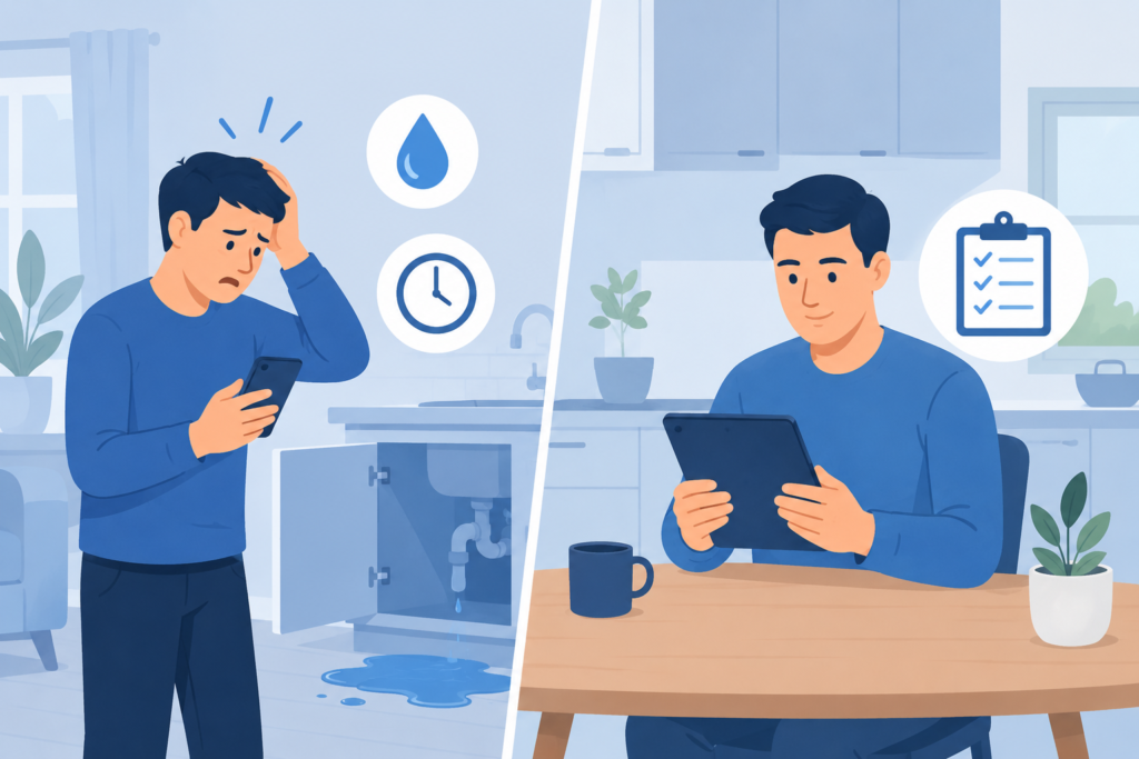
Almost every visitor lands on a plumber’s site in one of two mindsets: urgency or planning. One has water actively spreading through their home right now. The other is comparing quotes for a bathroom renovation that isn’t due to start for six weeks.
Miss this distinction and you lose one group or the other. A homepage that leads entirely with “24/7 EMERGENCY” makes a renovation customer wonder if you’re too small, or too frantic, for a considered job. A homepage that opens like a corporate brochure loses someone standing in a flooding hallway before they finish reading the first paragraph. That’s why emergency plumber website features need to prioritise speed, visibility and immediate contact.
The fix is structural, not cosmetic: separate the two paths in the first screen, so both customers recognise within seconds that they’re in the right place.
The Homepage Has About Five Seconds to Do Its Job
Visitors don’t read a homepage top to bottom. They scan it, and within a few seconds they’ve usually decided whether to stay or leave.
That means the homepage needs to answer three things almost instantly: what plumbing services you provide, where you operate, and how someone gets in touch. Everything else, awards, mission statements, long paragraphs about company values, can wait until further down the page.
A phone number that’s visible without scrolling and clickable on mobile does more for conversions than almost any other single design decision on a plumber’s site.
Licensing Is Where Trust Either Starts or Falls Apart
Plumbing carries a legal weight most trades don’t. In Western Australia, only a plumber holding a licence from the Plumbers Licensing Board can legally carry out water supply, sanitary and drainage work, and gasfitting requires a separate licence from Building and Energy. This isn’t a compliance footnote. Hire an unlicensed plumber for gas or backflow work, and the customer, not just the tradesperson, carries the risk.
Most plumbing websites bury their licence number in eight-point footer text, if they mention it at all. Stating it clearly, and telling customers exactly where they can verify it themselves, does more trust-building work than almost any other single sentence on the page.
Don’t just claim to be licensed. Prove it’s checkable.

Service Pages Should Answer "Is This My Problem?"
Blocked drains, hot water systems, leak detection, gas fitting, bathroom renovations, emergency callouts, most plumbing businesses cover all of it, and most plumbing websites explain none of it properly. One paragraph trying to cover six services usually ends up saying nothing useful about any of them.
Give genuinely distinct services their own space. Explain what the job involves, what typically causes it, and what happens once someone gets in touch. A blocked drain and a hot water system replacement aren’t the same urgency, the same price range, or the same decision, treating them identically on the page shortchanges both.
This doesn’t mean a page for every task imaginable. It means real space for what people actually search for, with everything else living under a broader section instead.
Service Area: Be Specific, Not Generic
“Perth-wide plumbing” tells a visitor almost nothing useful. Someone in Rockingham wants to know if you actually take jobs that far south, not whether “Perth” technically includes their postcode.
If there are suburbs or regions genuinely serviced regularly, name them clearly, without turning the page into a suburb list stuffed purely for search engines. It gives real customers real information, and gives search engines useful local context at the same time.
Before adding a suburb to the list, ask one question: would a real customer find this useful, or is it only here because it might help rankings? If it’s the second, cut it.
Photos of Actual Work Beat Any Stock Image
Plumbing is physical, visible work, and that makes it one of the easiest trades to prove through photography. A photo of a completed hot water system install, a repiped bathroom, or a cleared and camera-inspected drain tells a customer more in two seconds than a paragraph of copy could in two minutes.
Stock photography makes every plumbing website look interchangeable. If two plumbers in the same suburb both use a generic photo of a wrench and pipe, neither one stands out, and neither one proves anything.
It doesn’t need to be professional photography. A clear, well-lit photo taken on a phone after a job, with the customer’s permission where appropriate, does the job perfectly well. What matters is that the work shown is real and belongs to the business claiming it.
Reviews Belong Near the Decision, Not Buried on a Separate Page
A standalone testimonials page is where trust signals go to die, most visitors never click through to find it. Put a handful of genuine reviews next to the relevant service, or next to the enquiry form, and that trust signal lands exactly where the decision is actually being made.
Reviews should stay exactly as customers gave them. Editing feedback to sound more polished, or inventing testimonials that don’t exist, undermines the entire point of using them, and creates a genuine trust and compliance risk.
Make Contacting You Require Almost No Effort
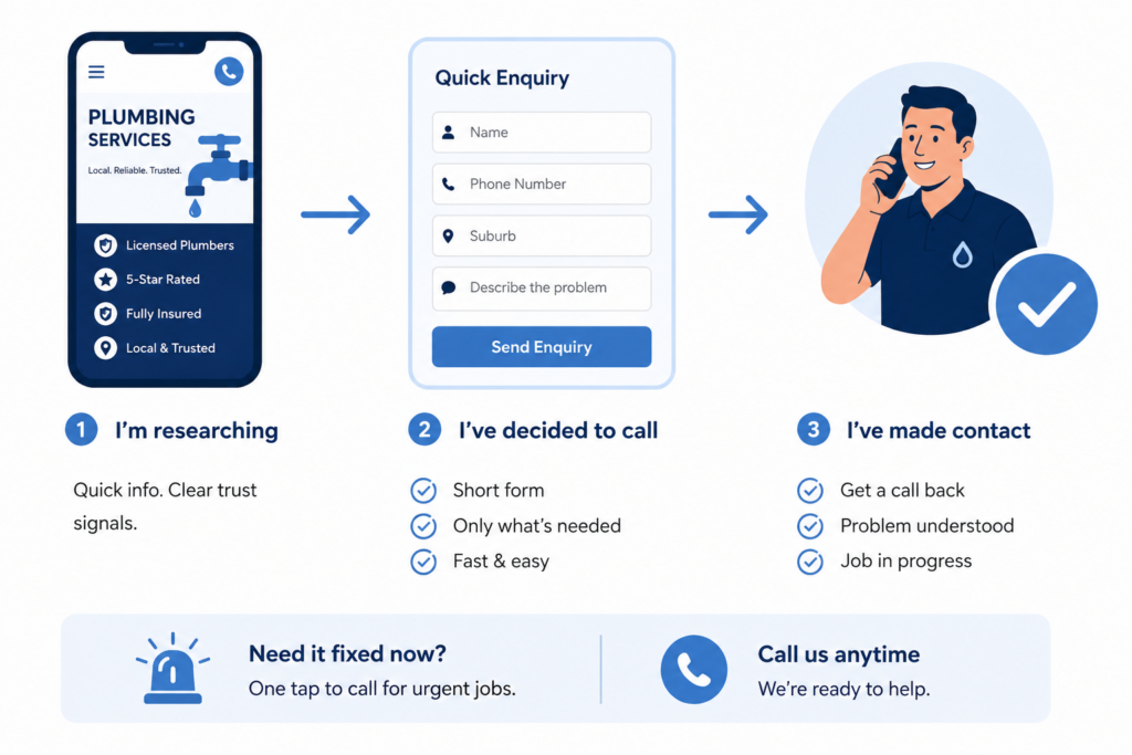
Every extra step between “I’ve decided to call” and “I’ve made contact” is a chance for a customer to leave and try someone else instead. For a plumber’s website, that means a clickable phone number, a short enquiry form that only asks for what’s genuinely needed, and contact details that are easy to find on every page, not just one.
For urgent jobs, forcing someone to fill out a ten-field form before they can reach you is close to self-sabotage. A name, phone number, suburb and a short description of the problem is usually enough to start the conversation. The rest can happen on the call.
Mobile Experience Isn't Optional — It's Where Most Customers Actually Are
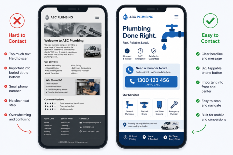
Someone dealing with a plumbing problem is very often searching from their phone, sometimes standing in the exact room the problem is happening in. If the site is slow to load, the text is too small to read, or the phone number isn’t tappable, that’s friction at the worst possible moment.
Checking a plumber’s website on an actual phone, not just resizing a browser window, is one of the simplest ways to catch usability problems most designers miss. Buttons that are hard to tap, forms that don’t work properly, and slow-loading images are all the reason someone closes the tab and calls the next plumber on the list.
The Basics of Local SEO Still Matter Most
Search engines and customers are trying to answer the same three questions: who is this business, what do they do, and where do they work? For plumbers competing locally, that also means understanding how plumbers rank in Google’s local map pack. Clear page titles, real service pages, one consistent set of business details across the entire site, an actively managed Google Business Profile, and content written around the questions customers actually type into Google, that’s the whole list. Nothing here needs “plumber Perth” repeated in every paragraph. It needs the business to be unmistakable.
Be Honest About Who You Are and What You Offer
Letting a plumber into a home or business involves a level of trust most other purchases don’t require. A short, honest About section, covering who’s behind the business, relevant licensing or experience, and the areas typically serviced, goes a long way toward closing that trust gap.
The same honesty applies to expectations. Do you offer after-hours emergency callouts? What areas do you actually cover? Do you provide upfront quotes? The honest answer matters more than the appealing one. If emergency callouts aren’t offered every night of the week, say so clearly, that’s a far better outcome than a frustrated customer discovering it at 11pm. If response times vary depending on the job and location, explaining that plainly builds more trust than a vague promise that can’t always be kept.
What Separates a Website That Works From One That Just Exists
A plumber’s website has one job: remove enough uncertainty that picking up the phone feels obvious. It doesn’t need an elaborate design to do that. It needs to consistently answer six questions before the visitor has to ask them: what you do, whether you cover their area, whether you’re properly licensed, whether the work in your photos is real, what past customers actually experienced, and how fast they can reach you.
Once you know what a plumber website actually needs, the next question is usually what that investment should cost. We’ve broken down how much a plumber website costs in Perth across different levels of website scope.
If you’re auditing an existing site, don’t start with a redesign. Start with whichever of those six is currently missing, unclear licensing, vague coverage, stock photography, or a contact process with too many steps.
If you’re building from scratch, or replacing a site that isn’t earning its keep, our approach to plumber website design in Perth breaks down exactly how we build for local plumbing businesses.