
10 Electrician Website Examples in Australia
Written by the Sclouta team. Published 27 July 2026.
Search “electrician website examples” and you’ll mostly find two things: American listicles full of businesses you’ll never call, or generic “10 best” articles that were clearly never opened past the homepage screenshot.
We wanted to do something more useful. So we picked ten real, currently trading Australian electrician businesses mostly Perth, with a couple of Melbourne comparisons, opened every site properly, and worked out exactly what each one gets right, where it falls short, and what an electrician actually planning a new website can take from it.
We’re not ranking these from best to worst. Different businesses need different things from a website, a solo operator building local trust needs something different from an established firm chasing commercial contracts. What we’ve done instead is show you ten different approaches, honestly reviewed, so you can see which pattern actually fits your business.
1. QuikFire Electrical — Perth-wide
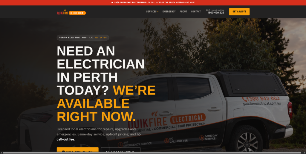
What it does well: QuikFire’s homepage leads with urgency (“Need an electrician in Perth today? We’re available right now”) backed by a genuinely rare feature: a live, embedded Instagram feed showing real, recent job photos, not stock images, actual switchboards and installs from the last few weeks. The site names the owner (Dion, trading seven years) and individual crew members by name. Google reviews cited are recent and dated (July–August 2026), which matters more than most electricians realise, a review from 2019 doesn’t prove anything about today’s service.
What to watch out for: The homepage is dense, service icons, a promo card, a three-step process, reviews, service areas and an FAQ accordion all stacked on one page. On mobile, that’s a lot of scrolling before the visitor reaches the FAQ section, which answers genuinely useful questions like pricing and call-out fees.
What electricians can learn: Live or recently-dated proof beats static proof. A five-star badge with no date attached is easy to distrust; a review timestamped last month, or a real Instagram feed updating in real time, is much harder to fake and much easier to believe.
2. Electricians Near You — Perth
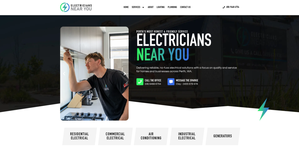
What it does well: This is the most personal site in the list. Instead of a generic contact form, the homepage offers “Message Clay the Sparkie” with a direct mobile number, not a business landline, an actual person’s number. The tagline, “Perth’s most honest, no-fuss electrical service,” commits to a specific personality rather than generic professionalism, and the site backs it with real job photos and a described focus on residential, commercial, air conditioning, industrial and generator work.
What to watch out for: The homepage is comparatively sparse, services are listed but not deeply explained, and there’s no visible review count or star rating on the page we reviewed, which is a missed trust opportunity given how strong the personal positioning already is.
What electricians can learn: Naming a real person and giving them a real contact method is a low-cost, high-trust move that most electrician websites skip in favour of generic “Contact Us” forms. If you’re a small or solo operation, this is one of the cheapest trust signals available to you.
3. Brillare Electrical — Perth
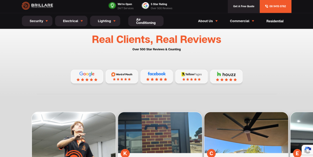
What it does well: Brillare stacks trust from multiple independent sources, Google, Word of Mouth, Yellow Pages and Houzz badges all appear together, alongside a stated 500+ review count. The site includes a video in the hero section, lists commercial client logos, offers buy-now-pay-later options (Humm, Afterpay, Zip) for larger jobs, and names individual technicians in testimonials (a client specifically credits “William” and “Stefano’s team”). NECA accreditation is displayed, and a workmanship guarantee is stated clearly.
What to watch out for: With this much packed onto one homepage, video, multiple review badges, financing options, service categories, security systems, testimonials, the page can start to feel busy on a smaller screen, and the sheer volume of trust signals risks diluting the impact of any single one.
What electricians can learn: Diversifying proof across platforms (not just Google) makes trust harder to dismiss as one curated review set. But there’s a ceiling, more badges isn’t automatically better if the visitor can’t process them quickly.
4. Westline Electrical Services — Perth
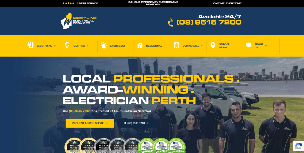
What it does well: Westline leads hard on urgency and volume: “Available 24/7,” a 5-star rating built on 536+ Google reviews, a real, current dollar-value offer (“$55 off when you book online today”), and the business’s electrical contractor licence number (EC11867) referenced directly. The reviews shown include recent, dated entries with full names.
What to watch out for: The page repeats the same “$55 off” banner and CTA multiple times down the page, good for reinforcing the offer, but it can start to feel repetitive rather than adding new information as the visitor scrolls.
What electricians can learn: For an emergency-positioned business, review volume and urgency messaging working together is genuinely effective, a stressed visitor with a power fault doesn’t need convincing with nuance, they need fast reassurance. That’s a different job to the trust-building a routine maintenance visitor needs, and it’s worth designing for the specific mindset of your actual customer.
5. Luno Electrical — Melbourne
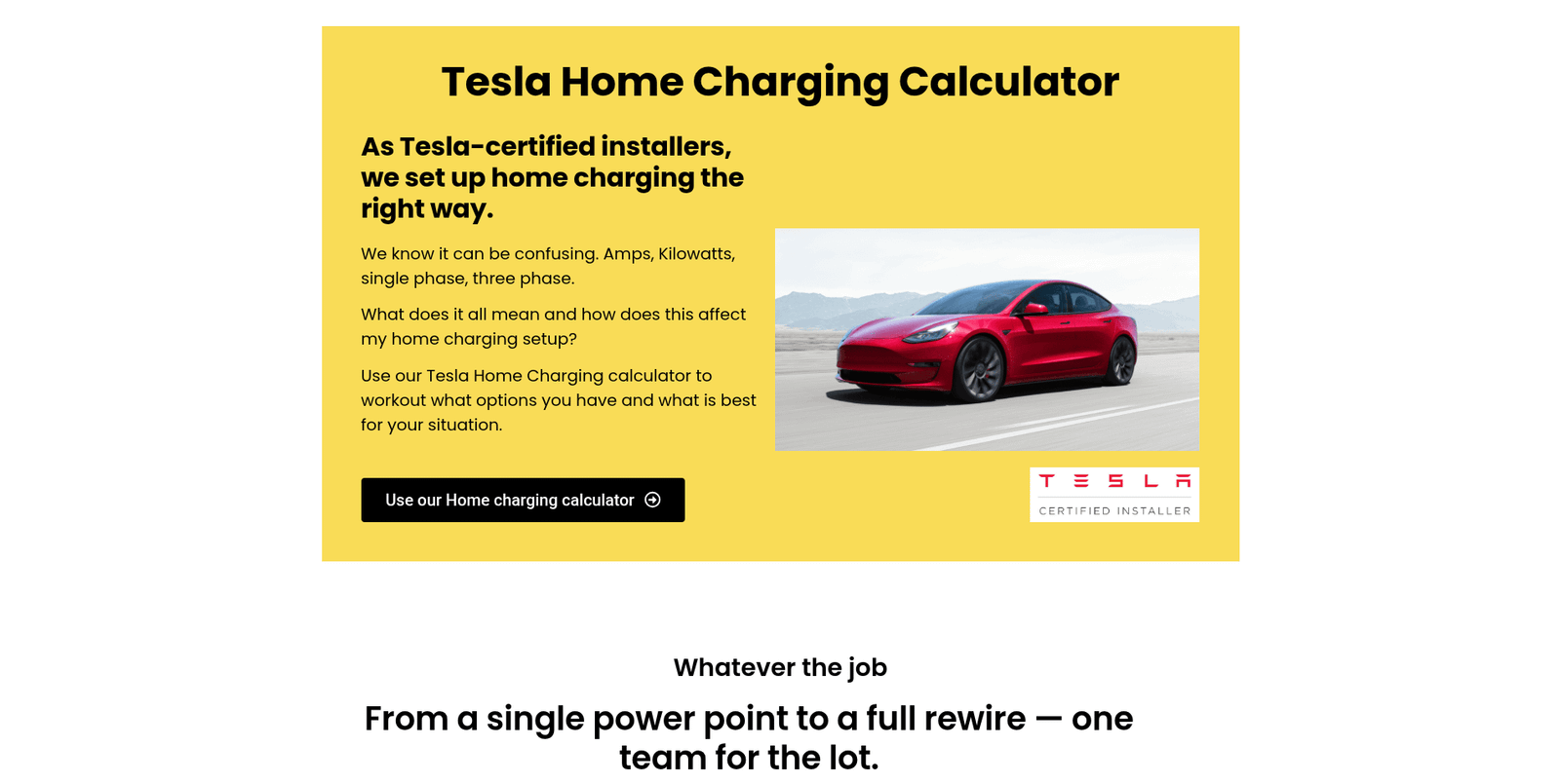
What it does well: Luno takes a different approach to trust entirely, not volume, but specificity. The site names the electrician (Andrew) directly, includes a real video showreel, and lists exact suburbs served (Hawthorn, Kew, Toorak, Camberwell and others) rather than a vague “Melbourne-wide” claim. Testimonials read like genuine conversations, customers thank “Andrew and Alex” by name and describe specific jobs (installing data cabling, restoring power to a dry-cleaning workshop) rather than offering generic praise. A Tesla Home Charging Calculator adds a genuinely useful interactive tool most electrician sites don’t attempt.
What to watch out for: Because Luno leans on personal trust rather than volume, the site would benefit from a visible aggregate review count near the top, it’s present (“5.0 Google rating from 200+ reviews”) but positioned further down the page than a first-time visitor might scroll.
What electricians can learn: If you don’t have Westline’s twenty-year review history, you can still build strong trust through specificity, name your electrician, name your actual coverage area, and let detailed, believable testimonials do the work instead of vague claims.
6. Amp Electrical Perth — High Wycombe
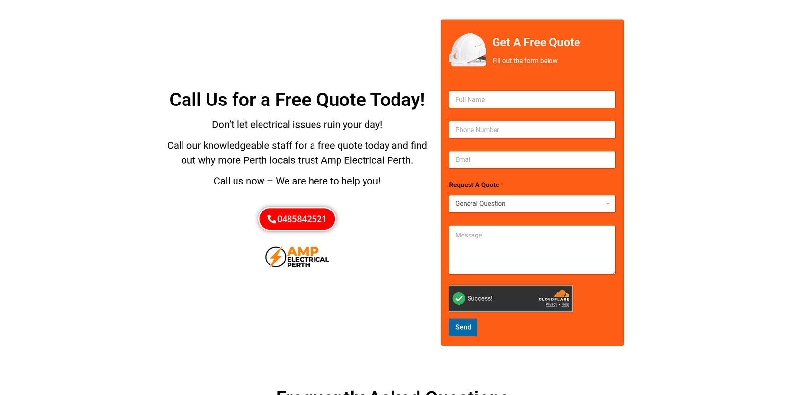
What it does well: Amp Electrical leads with clarity on pricing friction: “No Call-Out Fee!” is stated prominently and repeated through the page, alongside licensing and insurance claims. The FAQ section is genuinely substantial, covering pricing, licensing, emergency response and insurance, which directly answers the objections a hesitant customer is likely to have before they’ll call. The named electrician, Ryan, and licence EC14357 are both referenced.
What to watch out for: The page is very long and text-heavy in sections, with several near-identical service headings (“Commercial Electrician Perth, Reliable Power Solutions”) repeated with only minor wording changes, a pattern that reads as SEO padding rather than genuinely distinct content, and risks feeling repetitive to a real visitor.
What electricians can learn: A strong FAQ section addressing real objections (cost, licensing, response time) does real conversion work. But repeating near-identical headings to target keyword variations is a trade-off, it may help some search terms while making the page feel less genuinely helpful to the person reading it.
7. Steven Murphy Electrical Contractors — Perth
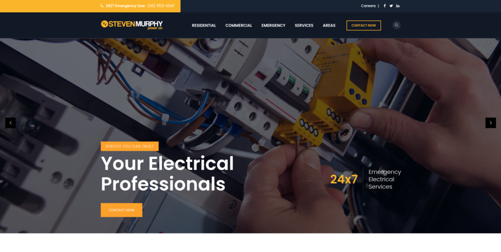
What it does well: This is a genuinely established business, 32+ years trading, licence EC4452, 15 electricians, and specific claims (100+ projects completed, 20+ workers employed) presented as real numbers rather than vague claims. The site includes a real blog with posts dating back to 2019, named technicians credited in testimonials (Josh, Carlos, Chris), and broad coverage of Perth’s western suburbs.
What to watch out for: The design itself is dated, smaller mobile-unfriendly text blocks, a busy layout competing for attention, and a blog that hasn’t been updated recently despite being a genuinely good asset. This is a strong business represented by a website that undersells it.
What electricians can learn: Longevity and real credentials are valuable, but only if the website presents them credibly. A business with three decades of runs on the board deserves a design that matches that trust, not one that makes a 32-year-old company look like it hasn’t updated its site since 2019.
8. Rhen Electrical — Joondalup
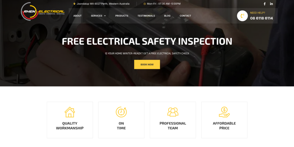
What it does well: Rhen keeps its trust signals simple and clean: four icon-based pillars (Quality Workmanship, On Time, Professional Team, Affordable Price) sit directly below the hero, followed by four clear service sectors (Residential, Commercial, Industrial & Warehouse, Strata & Real Estate). A free electrical safety inspection offer gives visitors a low-commitment first step, and a named customer testimonial (Jade Leaf) adds a specific, believable voice.
What to watch out for: The homepage has noticeably large empty gaps between sections on both desktop and mobile, likely a template or content-loading issue, which makes the page feel unfinished in places, even though the content itself is solid.
What electricians can learn: Clean, simple trust pillars work well when a business serves genuinely different market segments (residential through to strata), segmenting by sector helps each visitor self-identify quickly. But a clean design still needs proper technical execution; visible layout gaps undercut an otherwise professional impression.
9. Perth Inner South Electrician — Victoria Park
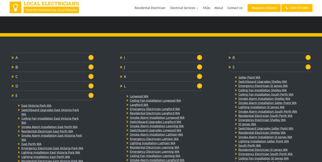
What it does well: To be fair to this one: the site does attempt broad topical coverage, targeting numerous specific services (circuit breaker upgrades, outlet and switch repairs, home lighting, ceiling fan installation) across a defined service area.
What to watch out for , and this is the important lesson: This site shows clear signs of being built as volume-first, trust-second content. The same phrases repeat almost verbatim across sections (“residential electrician Perth Inner South” appears dozens of times), an entire suburb-by-suburb service area list is generated in an alphabetical grid with no individual detail per suburb, and, most importantly, there are no visible reviews, no named electrician, no team photo and no licence number referenced anywhere on the homepage we reviewed.
What electricians can learn: This is the clearest example in our list of a site built for search engines first and real visitors second. Ranking for a keyword means nothing if the page that ranks can’t answer the basic question every real customer asks: is this a real, trustworthy business? Content volume without trust signals can create a poor experience for visitors, even when the site targets a wide range of searches.
10. Platinum Electricians — National
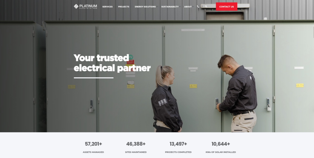
What it does well: Platinum operates at a completely different scale to every other site on this list, triple ISO certification (9001, 4801, 14001), stated figures like 57,000+ assets managed and 13,000+ projects completed, named commercial case studies (University of Sydney, Sydney Catholic Schools, Department of Communities), and a dedicated corporate social responsibility section covering First Nations programs and community initiatives.
What to watch out for: None of this is relevant or achievable for a local trade business, and that’s exactly the point — this isn’t a “better” website than the others, it’s built for an entirely different buyer (procurement teams and facility managers, not homeowners with a tripped switchboard).
What electricians can learn: The lesson here isn’t “add more badges.” It’s that trust signals should match your actual customer. A homeowner doesn’t care about ISO 14001 certification; a commercial procurement manager might specifically look for it. Know who’s actually going to read your site before deciding what to put on it.
What These Ten Examples Have in Common
Looking at all ten together, three things separate the genuinely strong sites (QuikFire, Luno, Brillare, Westline, Electricians Near You) from the weaker ones (Perth Inner South Electrician, and to a lesser extent Steven Murphy’s dated execution):
- Specificity beats volume. A named electrician, a dated review, an exact suburb list, these are harder to fake and easier to trust than generic claims or unlimited keyword-stuffed service copy.
- Trust signals should match the actual visitor. An emergency-positioned business (Westline) needs different proof to a niche commercial operator (Platinum). Copying another business’s trust strategy without matching your own customer is a wasted effort.
- A real business badly presented still loses to a real business well presented. Steven Murphy Electrical has 32 years of genuine credibility undercut by dated design. Perth Inner South Electrician has broad content with almost no verifiable trust at all. Both leave real value on the table.
A Simple Checklist for Your Own Electrician Website
- Is there a real, named person a visitor can identify, not just a business name?
- Are your reviews dated, and are they recent?
- Can a visitor find your licence number without searching for it?
- Does your service area say exactly where you work, not just “Perth-wide”?
- If you serve multiple customer types (residential, commercial, strata), does each one see relevant proof?
- Would a stranger reading your homepage believe you’re a real, currently-operating business within five seconds?
Looking for a Website Like the Strongest Examples Above?
The strongest electrician websites make it easy to understand the business, build trust and take the next step. That’s exactly what we focus on when building websites for trade businesses across Perth.